Typographic Design: Form and Communication book by Rob Carter, Ben Day and Philip Megs
Chapter 4 starts with thoughts on how legibility is often neglected by designers. Communicating clearly and appropriately should be a definite responsibility of typographers and designers. It is achieved by controlling the qualities and attributes inherent in typography that make type readable.
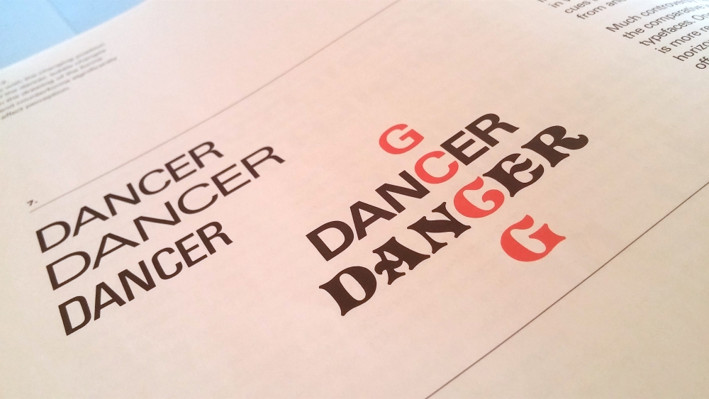
The basic structure of each letterform must remain the same, in spite variations in weight, size or proportion. As significant as the shapes of the letters are also counterforms. Inappropriate wordspacing and linespacing can also disrupt the reading.
Word recognition is based on a combination of word shape and internal word pattern and that is also the reason why word lowercase letters is more distinct (ascenders & descenders).
Because of typefaces’s unique shapes, proportions and individual characteristics we have to be extra careful when articulating color (thin strokes, small counters…).
” The whole duty of typography, as with calligraphy, is to communicate to the imagination, without loss by the way, the thought or image intended to be communicated by the Author. ” -Thomas James Cobden-Sanderson


