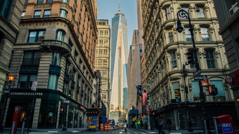
At the first look we might say Architecture and Typography are two completely different things, but if we think again, and take a closer look, we notice they actually share the same attributes. They both definitely have to look stable, so they have to be made of balanced shapes, transition of the curves has to be smooth and they both deal with inside and outside forms.
So why not combine them and see if they can work together?
And I did (bellow one of my examples) 🙂

With help of screen printing I achieved that “rough” hand-made look that blended architecture and typography quite nicely together.
I wanted to know more about architecture yet still connected to design, and I came across the book Form, Function and Design (Dover Art Instruction & Reference Books), that starts with a section “To a young designer” where author lays his guides to young designers. In one of them he says: “Don’t be afraid: either of your ideas, no matter how wild-or of the ideas of others, no matter how disturbing. Fear is the motive power of all intolerance, while no truly tolerant man can ever be afraid, and the artist must be uncompromisingly tolerant.”
In the chapter talking about form, author starts with, how every designer has to understand the laws of nature, the character and the needs of people, plus his own ideas and imagination. We could say that design is, where science and art intersect. As typography does, architecture as well deals with continuity (circle and curved lines) and discontinuity (angle and polygonal forms). Rediscovering Greek architecture during Renaissance, architects were trying to find a mathematical curve that the Greeks might have used it for their Doric capitals. It was found out that actually the curve was not a perfect curve, but the living forms of the common sea urchins in the Mediterranean.
http://4.bp.blogspot.com/-iC3QPnUpFI0/TtY8TmIdQhI/AAAAAAAAAcc/Hdch1kf3KzE/s1600/GreekDoricCapital.jpg
The design of the first airplanes was borrowed from kites, butterflies, and dragon flies as they needed the wide sailing surface to compensate the gravity. But as the need for speed increased, focus shifted to birds and then sharks, rays and squids.
http://www.wildanimalsonline.com/fish/mantaray-mantabirostris.jpg
The most powerful principle of all arts is the agreement and fusion of material and form, which have to match the nature of things. Even in painting, choosing different materials (oils, watercolour, pastel) can significantly affect on the end result and the way we interpret it.
“Art is not achieved by addition, but by a process of substraction that we call selection, or choice. The use of a great many materials in the same work does not show the imagination of the designer, but the contrary.”
You can get this book here:


